Welcome to part 2 of my series on basic book cover design.
Today I am going to be covering the basics of designing your cover, and things you should take into account.
This tutorial is specifically about designing covers for episodic reading platforms, but many of the points are relevant if you're designing ebook covers.
Because I write exclusively for Dreame I will be using my books on that platform in the examples.
I know that some of you may be wondering about the practical aspects of making your cover - that will be covered in the next installment. I am not doing that now because this post will offer some suggestions of tasks you may want to run through before you sit down to make the cover.
2 Things You Should Consider When Designing Your Cover
What genre is your book?
Do you want your book to fit in with the others, or stand out?
These may seem obvious, but if you are just starting out, or you are not from a design background, they may not be things you have considered before.
What Genre is Your Book?
It seems like such a simple question, but it is not always easy to identify the genre you're writing. Some books are clearly part of a particular genre, and those are a bit easier to design covers for. With books that are not so clear-cut, you need to list the genres your book could be a part of and decide which market you want to appeal to when your book is on the app.
Because there are so many books on the market you want people to look at your cover and have a rough idea of what your book will be like - a lot of readers on these apps love certain types of stories and they will definitely gravitate towards the books that have similar covers because you're signaling to them before they have even seen the title or blurb that this is a book that is going to be their kind of thing.
Suggested task:
Write a list of all the genres your book fits into and identify the genre you think will be most appealing to readers.
I'll give two examples from my own work for this task. One of them was easy to design the cover for, and the other one was a little trickier. I'll start off with the easy one.
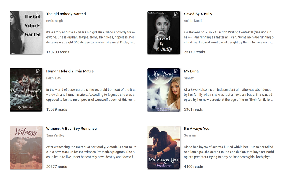
Witness: A Bad-Boy Romance
Young Adult
Romance
Bad Boy
If you are writing a book like Witness, it's going to be a lot easier to design the cover because it fits neatly into a specific genre.
It's a popular genre, and one that readers will browse through to find work they know they will enjoy because they love that type of book.
Suggested task:
Browse the lists of the most popular books in your genre and note any patterns you see on the covers.
At the moment, Witness is on page 3 of the most popular YA & Teenfiction when you filter by 'all'.

It's on the front page when you filter by 'updated in the past 3 days'.
Looking at these, you can see there are some obvious patterns in the cover designs of the most popular books.
When I was designing the cover for Witness I looked at the lists this way and I wrote a list of the elements I felt were most important to include:
At least one person
The 'dreamy' color palette focusing on the romance aspect OR
The sharp, harsh color palette focusing on the 'bad boy' aspect
A 'handwritten' style font
Two recurring elements I filtered out as being inappropriate for my cover were:
A wolf - Witness is not a werewolf novel
Black and white color palette - I didn't want to focus on the tragic element of my plot
"But I want my YA Romance about a Bad Boy falling in love with a Nerd to stand out!"
No, you don't.
Your editor will try their hardest to have your book promoted and listed in the recommended reading lists, and it's important that your book cover works for the genre they will be pushing your work in. If it looks out of place, it will be passed over for another book that does have an appropriate-looking cover. I know that is sad and frustrating, but it's what I have experienced.
Witness was written for the YA Writing Contest on Dreame, and out of more than 2000 entrants it placed 9th in the first round. The cover I designed was part of what made it successful - people knew it was a book that fits into that genre, and my editor was able to have it placed on lists and promotions as a result.
When you're writing for platforms like this, it is sometimes better when your work doesn't stand out.
"What if my book isn't a typical [generic genre] novel?"
If you're writing something that is a bit different and are trying to design a cover the first thing to ask yourself is 'am I kidding myself?'
It may sound a little harsh, and I know that we all like to think we're working on something genre defining, but I think it's OK to be proud of your books that do fit neatly into categories people are snooty about.
If you're working on an erotic novel where the new intern catches the eye of the handsome but elusive CEO then don't be afraid to admit it. I don't think you should have to justify yourself - whether you're writing it because you want a book that is going to bring in more of an income, or because you just really enjoy writing that type of book, you shouldn't be ashamed of your work.
I spent a long time feeling embarrassed about what I write, but you know what? People like reading erotica about the new intern who catches the eye of the handsome but elusive CEO. It's a wildly popular genre. The odds are you know plenty of people whose 'dark secret' is reading that kind of thing.
I've told 3 people in my 'real' life what I write, and all three of them sheepishly revealed that they love reading steamy books. It's not weird.
So my number one tip if you're writing a book that you think is different to everything else it is even remotely comparable to is to question whether it really is, or if you're just self-conscious about writing a particular trope.
It's OK to write generic novels that aren't mind-blowingly different from everything else on the market.
If you do some soul searching and accept that you're a really awesome writer of a certain trope, go back and follow the tips I gave for Witness. It will give your work a far better chance of being discovered by those readers who secretly love sappy romance/ steamy erotica / isekai etc and even if people aren't very open about reading it, the figures show that these books are really popular.
"OK, but what if my book really isn't a typical [generic genre] novel?"
If your book really doesn't fit neatly into a genre, it's going to be difficult to get it noticed on a reading platform because it may not be chosen for lists and promotions.
Not everyone writes for money, and some books are purely passion projects. I think that the books that fall into the 'it's just totally different to everything else and I don't know what to do' category are usually the books that are more personal projects.
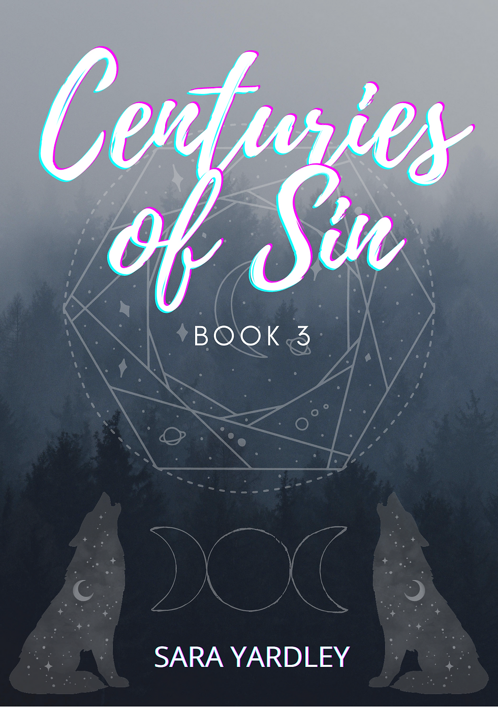
It's still important to give your book the best possible chance of being discovered by readers, and I am going to use the first book in my series Centuries of Sin as an example here.
Centuries is a werewolf novel, and it has a lot of erotica in it. If I wanted to slot it neatly into that genre I would design a cover that fit in with all the other books in that genre. It would have a photo of a wolf, a hot guy/ attractive woman, and potentially a full moon.
But I started writing it because I wanted to play with the tropes in that genre and do something different with them. I've only ever read snippets of Omegaverse stuff, and that is the adverts I kept seeing that made me cringe. (Again, they aren't all that bad anymore - there are still some that are horrendous, but I am not saying that all books on these ads are terrible!)
When I was designing my cover I thought that anyone looking for something Omegaverse-y was going to end up annoyed at my book and think the cover was falsely advertising the book as being something it is not.
I actually started off with a pretty awful cover that took me all of 5 minutes to produce, and only changed it after a few months. For the original cover, I tried to go for 'it's kind of like the others, but maybe a little darker':

When I redesigned the cover I made a list the way I did for Witness, and tried to pick out the elements that I think are key within the book:
Centuries of Sin
Werewolf
Erotica
Romance
Mystery
Thriller
Dark
Horror
I tried to come up with something that shows people it is a book with wolves in, but that it is potentially going to be different from other things they have read.
It's got wolves, but they're not photographs. It uses a font that is similar to others in the genre, but it uses a very different color palette.

By the time I designed the cover for book 3 I was far more confident of what the series is all about, and how I want to promote it.
I may end up redesigning the cover for book 1 again to make it more marketable, but I am happy that the book 3 cover does a great job capturing the tone of the book and giving some hints at what makes it special and, for people who have read the first two books, there are some clues about what may happen that they will appreciate a lot more than a picture of a shirtless guy.
Dark color palette
Wolves
'Occult' type imagery which ties in to wolves/ the moon
A forest
Is Centuries wildly successful?
Not exactly. The first book has more than 8000 readers, but it's never going to end up in one of the popular werewolf novel lists with the cover it has at the moment. If I want to get more readers I should probably redesign it. If I want the kind of readers I have - people who love how different it is, and that it doesn't do things you expect of that genre - I don't think I should change it.
It may not be wildly successful, but my readers are really passionate and loyal. They may not have given the book a chance if it had a more generic cover.
In the next installment, I'll run through a tutorial for actually making a cover. It will consider things such as the size the cover will be seen at, and elements that could cause problems on certain platforms.
If you're following the series you should start off part three with the list of elements you want your cover to have, and use those to guide you. I'll be making a cover and sharing images of the process step by step.
Comments