In the final installment of my series on making book covers I will be showing you how to make your own cover. I will guide you through the process by redesigning the cover for Centuries of Sin based on the tasks in part two of the Book Cover 101 series.
I will use Canva to make the cover, and the tutorial is based on making covers for the Stary Writing platforms (Dreame/Ringdom/Innovel etc) so double check things like dimensions if you write for another platform. I am using Canva Pro, which has more free stock images than the free version. You could either upgrade to Canva Pro, take advantage of a free trial of the Pro version, or stick to the free stock images. I am doing the tutorial on a laptop rather than the mobile version of the app.
Creating the Canvas
The first thing you need to do is open a fresh canvas to work on. You do this by clicking on 'Create a Design' in the top righthand corner of the home screen, and then selecting 'Custom Size' at the bottom of the list.

The dimensions that are given on Stary Writing for cover size are 600 x 800 pixels, or a ratio of 3:4. I always make my covers 3000 x 4000 rather than 600 x 800, because I like to have the option to make them into real notebooks and art prints, and that means that I want the files to be larger. If you don't plan on doing that 600 x 800 will be fine - the important thing to pay attention to is the ratio. When you have put the dimensions in it will take you to a page with a blank rectangle and some buttons on the left hand side of the screen.
This is your canvas; the blank page to the right of the screen is your future book cover.

Consider Using a Template
When you have created your page, you may like to take a look at the templates to see if there is one you could alter for your book cover.
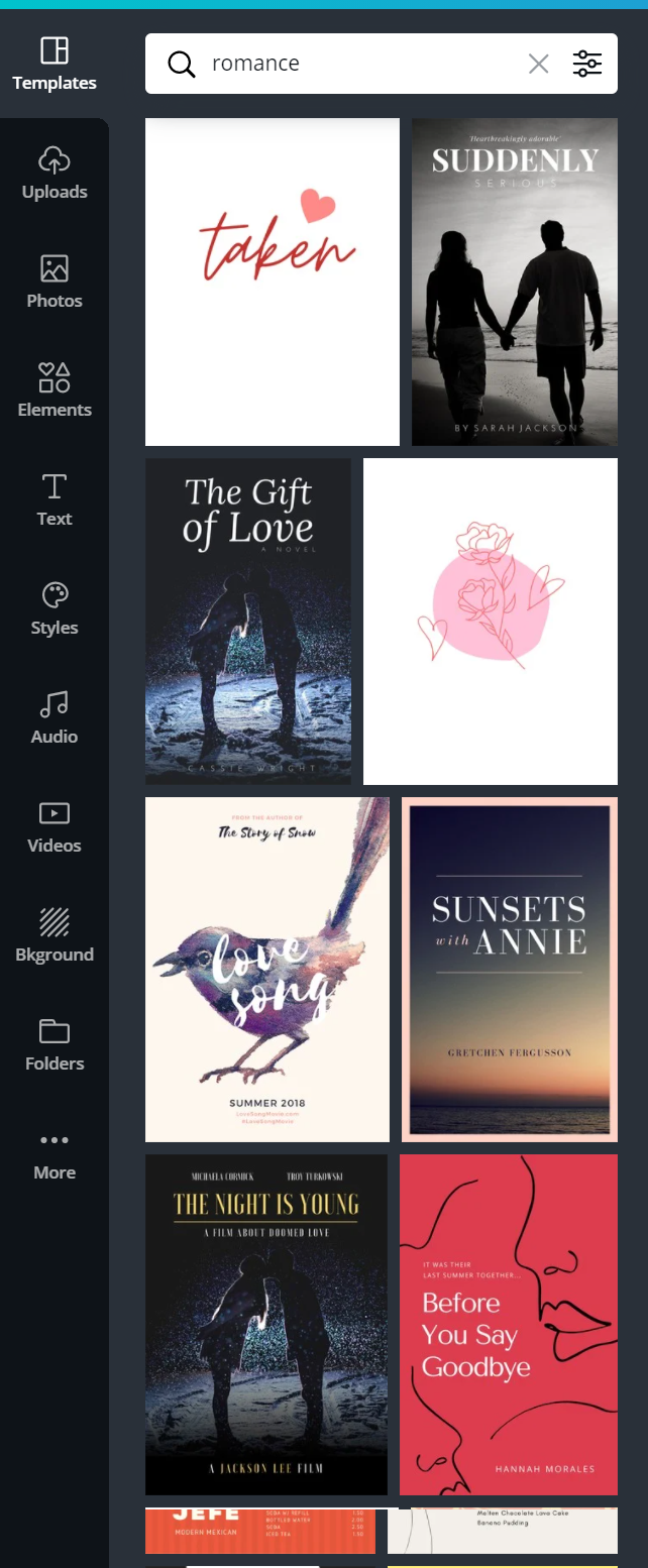
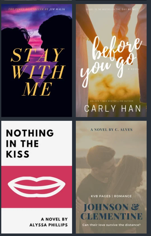
Searching for 'romance' gave a lot of templates that would be easy to customize for a romance novel. Many of these are for Pro members only, so it's worth upgrading or getting a free trial if you do fall in love with one of the templates.
Suggested Task:
Search for the genre you are creating your cover for. How many of the templates have features you wrote down to include in your own design?
Looking through the 'romance' templates I think that the one on the bottom right here would be a great choice for Witness based on the list I gave in the last post. The only feature it's missing from my list it that 'handwritten' font that is on the book on the top right.
It's also a clue that these covers are popular for a reason, and that you should be open to making a cover you might not love if you want your book to stand more of a chance of being marketable.
I'm going to be redesigning the cover for Centuries of Sin in this tutorial, so I'll start by putting some terms into the search bar based on the list I made in the last tutorial:
Centuries of Sin
Werewolf
Erotica
Romance
Mystery
Thriller
Dark
Horror
Werewolf and erotica didn't have any hits. Romance was mostly things like the ones above, which would make it hard for a reader to know there will be mystery and darker elements in the book.
The covers I thought fit with the tone of the book the best came up when I searched for 'thriller':
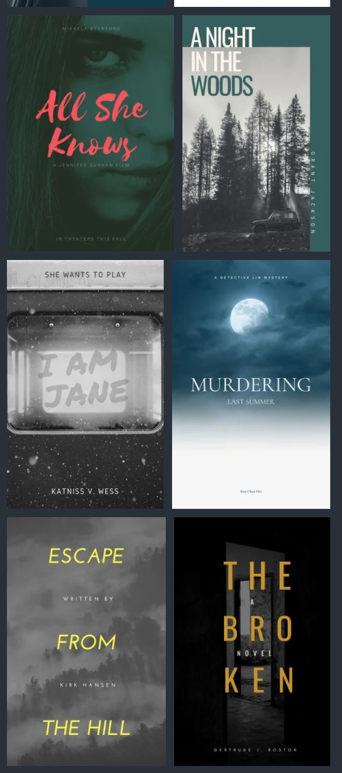
Even if I don't choose to alter a template, doing this was still a valuable exercise for me because I have now identified that the 'thriller' aesthetic is the kind I want to go for. That means I will be using a darker color palette, even if I decide to go for some more romance-y or generic erotica type tropes on the cover.
Fonts
For the sake of this tutorial I chose one of the templates to alter and offer some comments on. I'll explain what I think is wrong with this cover, and how I would change it. After that I will run through a design starting from scratch. The cover I have chosen from the templates is this one. The only change I have made is the title and the author's name.
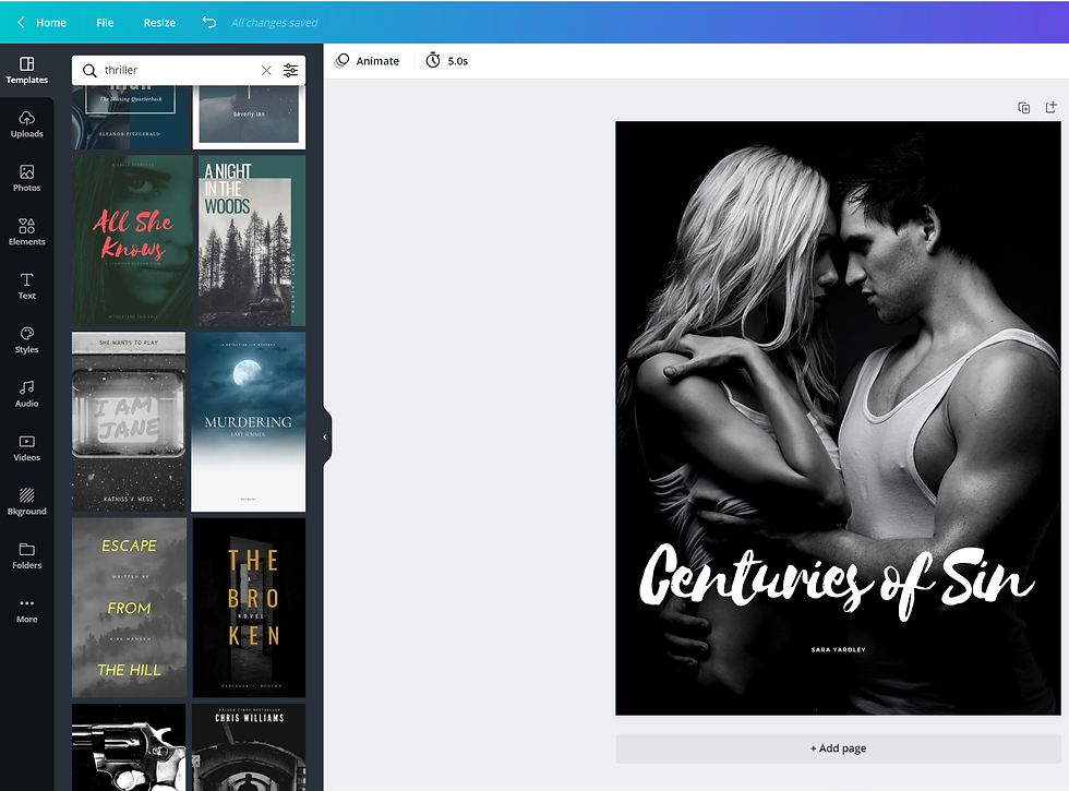
The first thing I would do if I was going to start with this template is the change the size of the author's name. It's small and difficult to read on my laptop - the actual thing will be about 1" / 2.5cm tall the first time most people see it. They will not be able to read your name if you don't make it big enough.
Even something as small as this immediately makes a big difference and improves the cover.

The next thing I would think of changing on this particular template is the font that has been used for the title. These handwritten fonts are cool - I see them a lot in romance novels at the moment, and I use them myself. The only trouble with them is that some of them aren't that clear. It can depend on the title of your book, so you do have to go through the options until you find one that is clear to read.
Remember that people are scrolling through an app when they first see your cover.
Not everyone knows what your book is called, and if it isn't clear it won't catch their eye.
I tried a few different fonts - I would settle on a couple you like, and then get someone else to take a look and let you know which is easiest to read.

Characters and Attention to Detail
In this section I'm going to talk a little bit about designing covers with your character on. I'll work on an example for Centuries. After that I will go through some other options for covers. At the end I'll put my final design together with the original, and my first redesign, so you can compare them.
I think the biggest issue with the template I chose is the fact the couple in the picture may be gorgeous, but they look absolutely nothing like my main characters.
My lead female in book one, Elizabeth, is a 5'4" tall redhead. Her partner is 6'3" tall, and he has dark blonde/pale brown hair.
This picture would work for a book with a tall blonde heroine and her raven haired lover, but that's not who my characters are or how they are described.
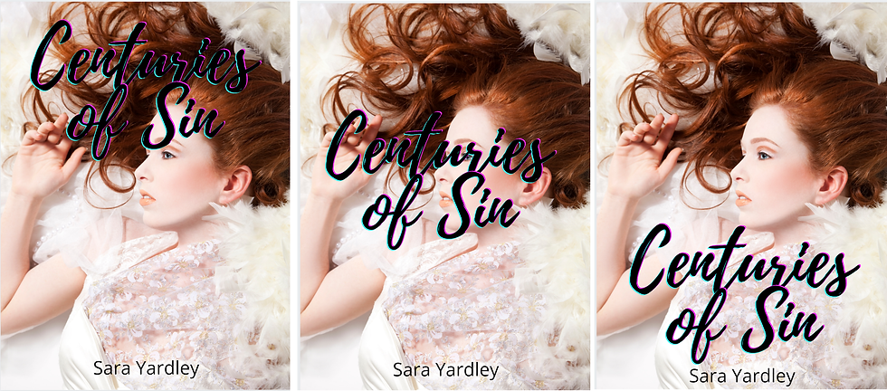
Here's the cover edited to have a stock image of a model who looks closer to the way I have described and imagine Elizabeth:

If you are lucky enough to find an image of a model who looks just like your main character, you should still consider whether it is appropriate for your cover.
Don't forget how important it is to make sure that the characters on your cover are represented the way you have described them in the book. It is about more than physical appearance.
In the example above I now have a cover with a woman who looks like Elizabeth, but she's not dressed in clothing that she would wear, and a lot of the elements in the kind of cover I am aiming for are missing. Nowhere on this book is there any indication that it has werewolves in it, or that it is set in the modern day.
I'm going to use my book Morrigan: I am Your Fate as another example of how important this is.
Morrigan is described in a lot of detail, and her appearance is very important. Her skin is tanned, she has pure white hair, and her eyes are the color of Baltic Amber.
The book is set in 15th Century Europe.
On the cover of my book she is shown as a cartoon, but exactly as she's described. White hair, tanned complexion, eyes that look like pools of fire. Her clothing matches the description of what she is wearing in the first three chapters of the book.
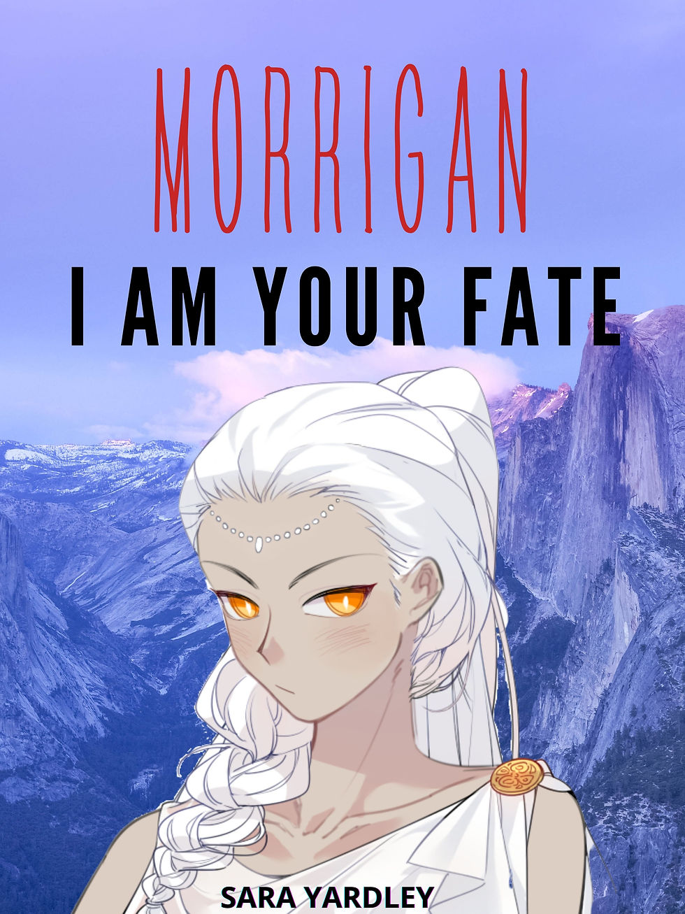
If you have a character with distinctive features like this, you have to make sure the picture you use on the cover reflects them.
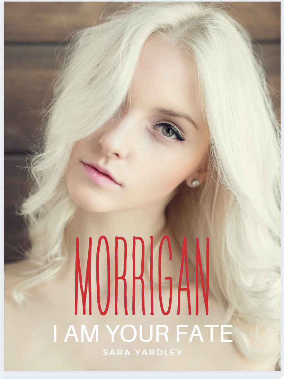
I found a lovely image of a woman with white hair on Canva, but she has pierced ears, modern make-up, and gray eyes. She's not Morrigan.
Layout
If you find a stock image which perfectly captures your character(s) you should consider whether it is going to work as a cover, or if you'll need to rearrange things so it is just one element of the design. I managed to find a stock image of a model who looks just like my main character in Centuries, so I will design a cover with that image as an example. This image actually works really well as a cover, because the model is wearing a white dress and that takes up a lot of the cover. It's obviously a wedding dress, but the silver lace across her chest is reminiscent enough of something I describe Elizabeth wearing that I will overlook that! Because the composition of the images has a lot of pale 'blank space' at the bottom, it's easy to position the title. If it's at the top the text it hard to read, and in the middle it covers her face.
Using Pictures as Elements in More Complex Designs
The cover above doesn't suck. It has a model who looks like Elizabeth, the title is clear, and my name is visible.
But it doesn't tick any of the other boxes on my list. This doesn't look like the cover of a mystery novel with murder, werewolves, and bad guys.
I think that the most important thing right now is to add something (anything at all!) that makes it clear this is a book with werewolves in.
Most books on reading apps will have a photograph of a wolf on them somewhere, but with a full-page photograph on the front I don't have many options for that which won't look cluttered, particularly on a smaller screen.
This is where it gets a little more complicated!
If you have been following along with the process above you'll have used the 'templates' tab, and you may have used the 'photos' tab to look for something if you wanted to change the image.
To design a more complex cover we're going to start off with the blank cover, and use more of the tools that Canva has to create something.
Complex Covers
Back to square one! I've decided I want to use that image of a redhead, but I also want a wolf on there somewhere. How do I do that without it looking like I made it on paint?
The first thing to do is choose a background. It's just going to be a placeholder, you don't have to stick with it. It just helps visualize things a bit better when you have something to start with. You can choose a background on the 'background' tab - I'll start off with this one of a forest, which is free, because forests appear a lot in the book and it's an atmospheric picture.

If you don't find a background you like, you can find a picture on the 'photos' tab and set it as a background by right clicking on the image and selecting 'replace background'

Try to think of the color palette you wanted to use, and the colors in any other images you have your eye on.
When you have your background in place, you can add some other elements - literally.
Click on the 'elements' tab on the left hand side, and a whole host of options appear.
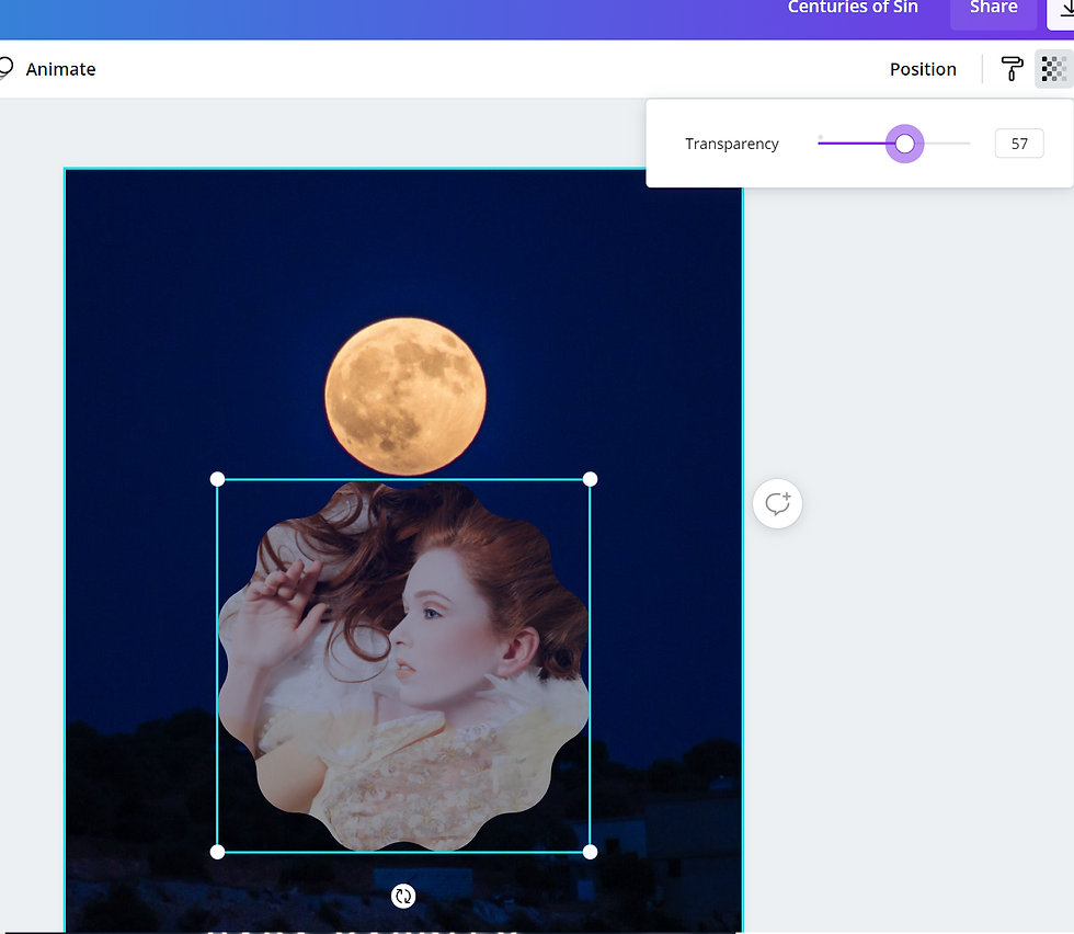
The first element I am going to add is a frame. Frames are boxes you drop your photos into, and the shape of the frame will crop the photo to fit it.

I'll pick a wacky one to show this clearly, and then find one to work with for the cover.
Add the frame to the cover, then drag and drop the photo you want into it.
If you want to reposition the photo in the frame, double click and move it around until you're happy with the position.

At this stage I decided I didn't like the colors of the forest with her hair, so I changed the background again.
That's not important, but that's why it is different below.
When you have the image in the frame you can move it around until you're happy with where it is, and when you have decided on the position it is a good idea to play with 'transparency' so it doesn't look like you just stuck the picture on as an afterthought. You do that by clicking the picture, and then selecting the button in the top corner which looks like a chessboard and moving the slider around.
Canva also has a lot of filters, so you can try playing with those, which you find by clicking on the 'filter' button on the top left.
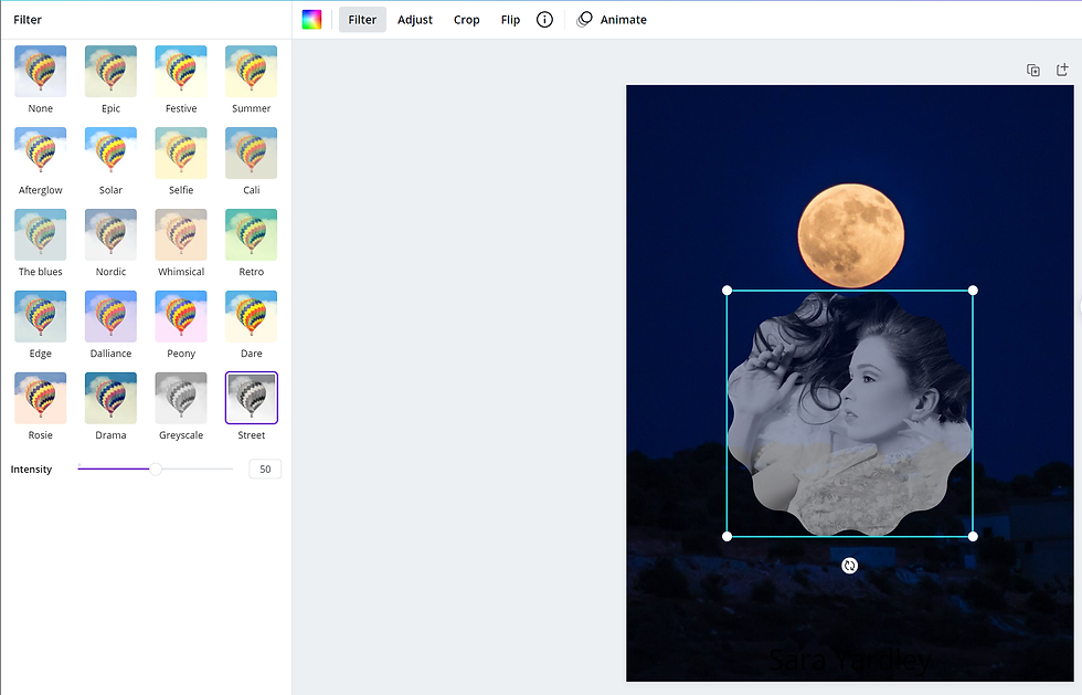
I guess that is one way around it if you can't find a picture with the right hair or eye color! Continue to play around until you're happy. It can take a while to go through backdrops/frames etc until you find something that works, and that really is a design and preference thing. Look at the list you wrote when you were deciding on design elements, and make sure that all (or most) of them are there. When you're happy with the design, add the title and your pen name. This is the same as it is when you move it around on the template, you just have to select 'text' on the tabs at the left of the page to add the title.
You can also add filters and effects to writing and adjust the transparency in the same way as you can do with images. Some of them can help with making the text easier to read, and some of them look like you made the cover on a late 90s edition of Word. This is my final design:

The features are a mix of the elements in popular steamy/romance books and darker thriller/mystery novels.
The wolf makes it clear it's going to be one of those steamy/romance books.
The text is large enough to read on a small screen
The font looks like the ones used on the more popular books, and I have chosen one which is legible
I've added a picture of a model who looks like my leading lady
I chose a darker color palette because it isn't a sappy romance
Here are all three versions of the cover. Version one:
"I have no idea what I am doing or why I am uploading this book. Why did I think this was a good idea?!"
Version two:
"My book is definitely different to every other book with werewolf erotica in, and I want it to look like it's cool and unique. Also, I have Canva Pro now and I can use all the fancy elements, woo!"
Version three:
"OK, it's werewolf erotica. Witness is doing reaaaallly well and I know the cover has helped that so just stop being stubborn and make a decent cover for Centuries."


I hope you found this series informative.
I have a few ideas for what to write about next, so I should have some more to share soon!
Comments